Pulished on Dec. 03, 2025
Color is not only a feast for the eyes but also a conveyor of emotions and taste. People will have a nice mood while using the wonderful dinner set such as ceramic bowls and
plates. Garbo Tableware uses color as a medium, skillfully employing gradients and contrasts to transform the dining table into artistic stage. Its designs blend global cultural
inspirations with sustainable concepts, making each piece of bowls and plates to be a focal point that brightens the dining experience. This article focuses on the pink gradient,
blue gradient, and gold and black combination schemes, analyzing how Garbo Tableware redefines the dining ritual through color storytelling.

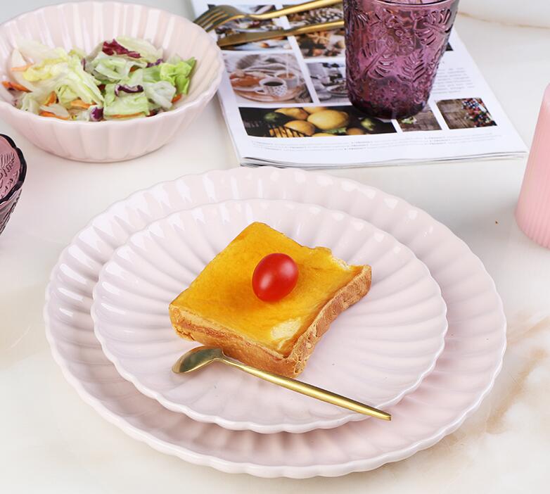
The pink gradient series is inspired by "dawn". Pink has a psychological effect of stimulating appetite and conveys warmth and vitality, making it particularly suitable for family
dinners or gatherings with friends.

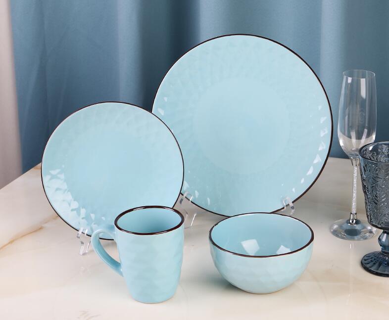
The Blue Gradient series is framed around the concept of "World Kitchen", integrating cultural elements from both the Mediterranean and Asia. The blue series of tableware is
made of eco-friendly ceramic materials. The dark glaze is more resistant to stains, while the light series can highlight the original appearance of the ingredients.

The gold and black series is themed around "the four seasons". The caramel color of autumn contrasts strongly with the black tableware, conveying a sense of understated luxury.
The gold is made of matte material to reduce reflection and avoid visual fatigue. The black is treated with an anti-stain glaze to enhance durability. For instance, after a
Michelin-starred restaurant adopted this series of tableware, it not only improved the dining experience but also conveyed the value of environmental protection. In terms of matching,
the gold tablecloth and black furniture form a contrast of light and dark, guiding the focus of the eyes. Seasonal decorations such as the wine red carpet in winter add warmth to the
black background, echoing the concept of "the balance between environmental protection and refinement". This design, through the principles of color psychology, turns solitary
dining into a self-healing ritual.
The pink gradient awakens tenderness, the blue gradient conveys serenity, and the collision of gold and black exudes luxury, jointly illuminating the artistic light of the modern dining table.